WRAP Website Redesign

Case Study

Overview:

Responsive Website Redesign of Non-Profit WRAP (WoMen's Rural Advocacy Programs).

Problem:

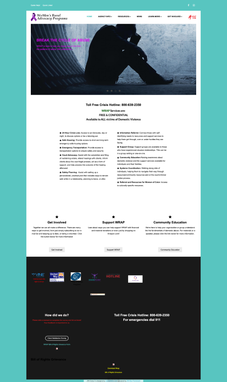
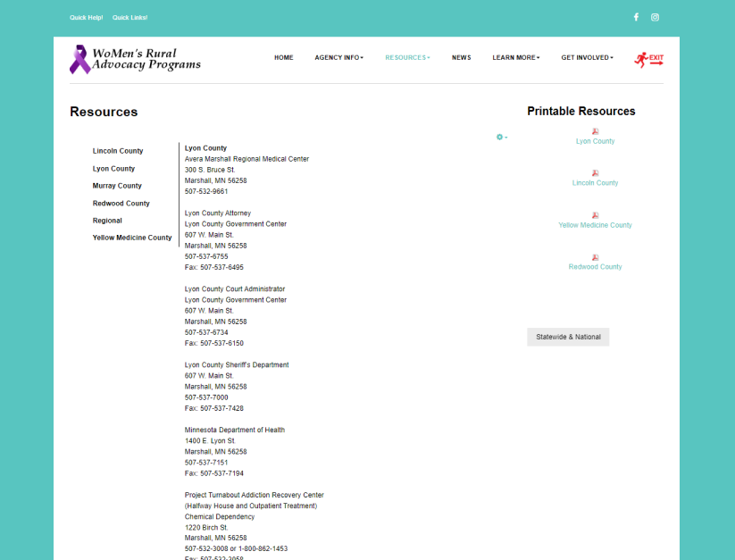
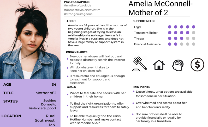
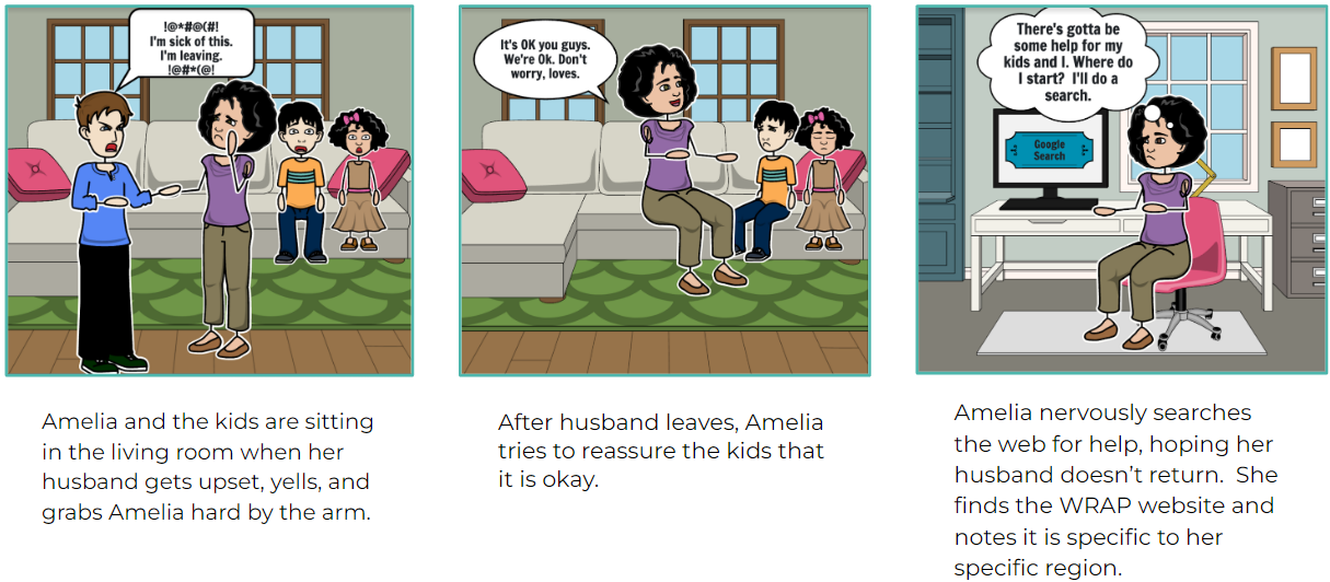
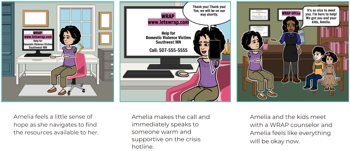
Persons experiencing domestic violence feel overwhelmed and intimidated when trying to leave an abusive relationship. They need to be able to easily access local resources that help them take the first step in leaving. This can be even more challenging in rural areas with less resources available.

Solution:

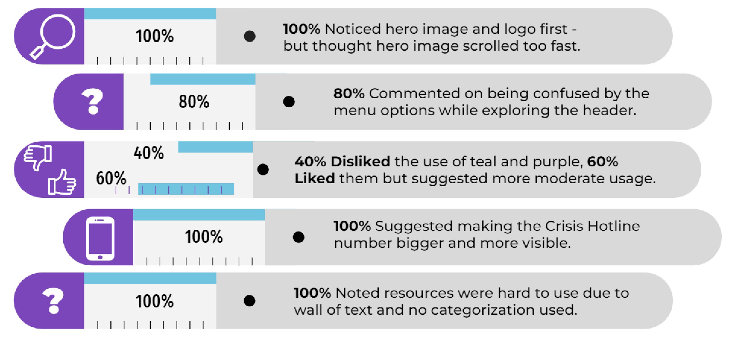
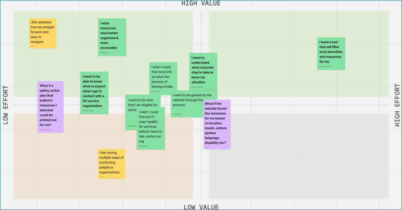
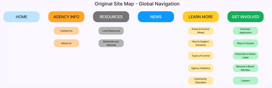
A human centered approach using the design process - empathize, define, ideate, test - to provide a more intuitive and efficient solution for users of the WRAP website.

Role:

UX/UI Designer on a team of three.

Phase I - Empathize

This project was focused on redesigning a non-profit website. After reviewing multiple websites serving people experiencing domestic violence, the team chose WRAP - WoMen’s Rural Advocacy Programs - as a site that could benefit from a human-centered redesign to provide a more efficient experience to those in need of services. Often, individuals in potentially dangerous situations, may have limited time to be able to look for the resources they are seeking. Making the services provided by WRAP easier and quicker to find and digest could potentially protect someone from harm.

Heuristics Evaluation:

The team began by performing a heuristic evaluation of the WRAP website - both the desktop and mobile versions. The Homepage and the Resources pages were the focus of this redesign project.

Key Findings Homepage:

  • Information in hero image is difficult to read
  • Global navigation is small
  • Poor layout/use of space - information is crammed together
  • Footer is excessively large and difficult to read

Key Findings Resource Page:

  • Not obvious left sidebar is a clickable menu
  • Weak visual cue as to what county submenu you are viewing
  • No categorization of resources - long list of text to sort through

Proto-Persona:

A proto-persona was developed to allow the team to start to better understand who may come to the WRAP site looking for help and build empathy for them.

User Research:

A usability testing plan was developed and utilized by the team to interview 6 individuals.

On both the desktop and mobile website, participants were asked to:

  • Find the 24-hour crisis hotline number
  • Locate a legal office within Redwood County
  • Locate the Marshall WRAP office contact info in order to make an appt\ointment
  • Provide general feedback about the website and its usability

Analysis:

Usability testing yielded valuable results including:

  • 100% of participants thought the hero image scrolled too fast and had difficulty reading the information on it
  • 80% of participants commented on being confused by the menu options while exploring the header
  • 40% disliked the use of the color scheme for the site. 60% liked them, but suggested more moderate usage of them.
  • 100% of participants suggested making the Crisis Hotline number bigger and more visible
  • 100% of participants noted the resource page was hard to use due to lack of categorization

Phase II - Define

Affinity Mapping and Empathy Map:

An affinity mapping process and empathy map was utilized to help further understand difficulties users of the WRAP site may experience, their needs for more efficient use of the site, and to build further empathy and solidify our User Persona of Amelia McConnell.

User Insight:

Amelia, is a young mother of two, in an abusive relationship. She is unaware of the resources available for domestic violence victims in southwest MN. Amelia is overwhelmed, intimidated and doesn't know where to start to seek immediate support to leave an unsafe situation.

Problem Statement:

Domestic violence victims in rural southwest MN need better assistance when looking for local support and resources as it is an overwhelming and intimidating step to take on their own.

Storyboard:

A storyboard was created to help demonstrate Amelia's experience and to help stakeholders build empathy for Amelia and other potential end-users like her.

Phase III - Ideate

Following the definition phase of our design process, and based on our user research analysis and affinity mapping, the team began the ideation process.

Feature Prioritization:

An 'I Like, I Wish, What If' exercise was completed to generate ideas of redesign options that would be beneficial for Amelia. With considerations to the length of the project, it was determined the scope of this redesign would include better global navigation layout, a filtration tool or categorization of resources and improved copy on the homepage, for inclusivity and organizational scope.

Site Map Redesign:

A card sorting process and site mapping redesign was completed in line with the goal of providing better navigation and organization of resources.

Wireframing:

Wireframe sketches were completed for initial redesign ideas. Through a discussion by team members of the proposed sketches and research findings, and the feature prioritization work, it was determined what layout and features would be included in initial digital wireframes and lo-fi prototypes.

Style / Brand:

While working through the design process, style and brand for the website was discussed. Due to the nature of the services WRAP provides, it was determined that the esthetics of the site needed to be affirming, welcoming, inclusive, discreet, and accessible. It was determined better use of imagery to provide a sense of hope over anguish would be valuable as well as a redesign of the logo for more inclusivity. Considering usability testing feedback, and that purple is the representative color of domestic violence awareness, it was determined the branding colors would be kept, but the use would be more subtle and include gradients.

Phase IV - Test

Lo-Fi Testing:

The initial lo-fi round of testing provided the team with valuable feedback. User testing feedback was gathered and grouped to find themes and where iterations would provide the most positive experience for Amelia.

Feedback included positives such as:

  • The hotline number in the top navigation bar is easy to see/find
  • The categories on the resources pages are a huge improvement
  • The global navigation menu items and dropdowns were easier to understand

Feedback also yielded valuable things to consider such as:

  • The homepage felt cluttered with the testimonial in the hero image
  • Further efficiency in navigation could be provided by listing the counties served in a dropdown submenu of the resources tab
  • The categorization of the resources was a huge improvement, but suggestions for different titles for categories were provided

Iteration:

Following the user testing analysis, iterations were made to the digital wireframes then the prototype was upgraded to hi-fidelity.

Key changes based on user testing included:

  • Moving the past client testimonial lower on the page
  • Updating the hero image with more inviting, welcoming, and hopeful imagery
  • Updating the global navigation site map with additional drop-down options for county resources for faster navigation

Hi-fi user testing was not completed due to time constraints for this project.

Redesign and Hi-Fi Prototype:

Future Iterations:

Additional redesign ideas that were considered and would be added to further iterative cycles include:

  • Adding a digital-safety warning modal upon entering the site
  • Additional user-testing for first round of iterations
  • Redesign of the additional pages on the site
  • Improved copy site-wide, including more victim/survivor-centered language and copy around what Amelia could expect the process to look like upon engagement with WRAP